Epidemic Curves of COVID-19 in the World which are Similar Within but not Across Regions
The number of the COVID-19 patients (P), that of the deaths (D) and the case-fatality rate (D/P) were followed daily from 3 January 2020 till 22 December 2023 for countries in Western Pacific, European, American and African regions. The shape of the epidemic curves was similar within but not across the regions. The number of the patients was proportional to the population size and case-fatality rate was around 0.01 for all the countries except African countries where the number of the patients was not correlated with the population size.
Introduction
Epidemic of COVID-19 started in Wuhan in People’s Republic of China in mid-November in 2019 and spread worldwide [1, 2, 3, 4]. As of 19 December 2023, 772,838,745 confirmed cases and 6,988,679 deaths were reported to WHO. The number of the patients started decreasing in June 2022. On 22 December 2023, only 26 deaths were reported in the world in the last 7 days (WHO Coronavirus (COVID-19) Dashboard).
I found that the COVID-19 epidemic was synchronized among prefectures in Japan [5] and among nearby countries [6]. This paper examines extent to which COVID-19 epidemic was synchronized among countries in different regions in the world.
Data Source
Data were obtained from WHO-COVID-19-global-data (https://covid19.who.int/WHO-COVID-19-global-data.csv COVID-19 data | WHO COVID-19 dashboard). Countries examined were: China, India, USA, Indonesia, Pakistan, Brazil, Nigeria, Bangladesh, Russian Fed, Mexico, Japan, Philippines, Egypt, Congo, DR Congo, Viet Nam, Iran, Turkey, Germany Thailand, Bulgaria, UK, UR Tanzania, France, South Africa, Italy, Myanmar, Kenya, Colombia, Rep Korea, Spain, Uganda, Sudan, Argentina, Algeria, Iraq, Afghanistan, Poland, Ukraine, Canada, Morocco, Angola, Uzbekistan, Yemen, Peru, Malaysia, Ghana and Nepal.
Epidemic Curves
The number of the patients (P), that of the deaths (D) and case fatality rate (D/P) were plotted in the vertical axis along days stating from 3 January 2020 till 22 November 2023 in the horizontal axis. It was found:
- In Europe (Figure 1), the epidemic curve was similar for Azerbaijan and Armenia, for Finland and Austria, for France and Germany, for Norway, Denmark and Sweden and for Italy and Spain, respectively. The pairs are all nearby countries. The epidemic curve of Romania with three conspicuous peaks in the middle of the epidemic was different from the other European countries.
- In America (Figure 2), the epidemic curve was similar for Canada, Mexico, USA, Guatemala and Costa Rica all in North America, and for Chile, Columbia, Ecuador, Peru, Brazil, Argentina and Uruguay all in South America.
- In Asia (Figure 3), the epidemic curve was similar for New Zealand and Australia, for Cambodia, Vietnam and Sri Lanka, for Republic of Korea and Japan and for India, Indonesia, Bangladesh and Philippines respectively.
- In Africa (Figure 4), the shape of the epidemic curve was similar for Zambia, Angola, Namibia, South Africa, Zimbabwe, Malawi, Kenya and Ethiopia, for Libia and Algeria and for Mauritania and Nigeria respectively.
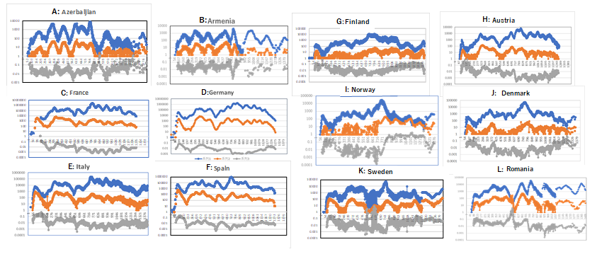
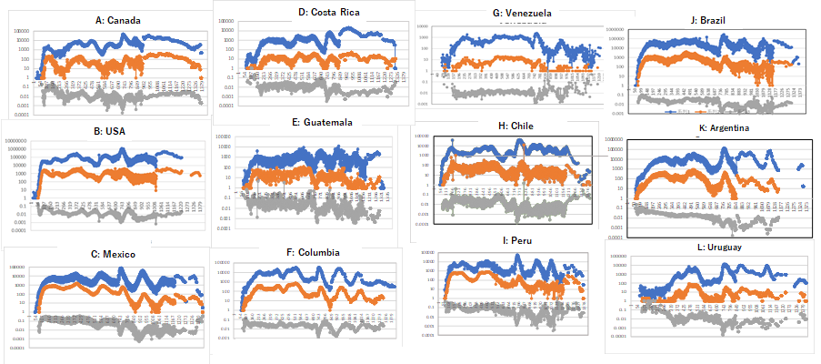
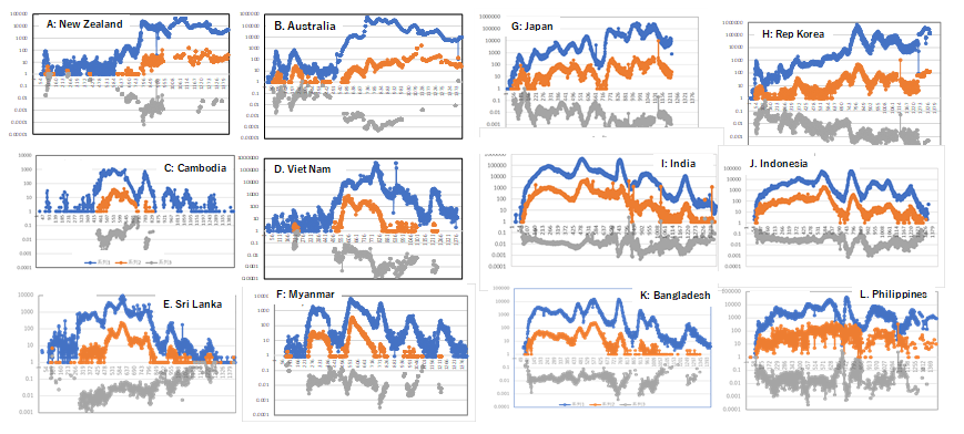
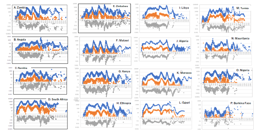
Figure 4: Epidemic curves of COVID 19 in Africa. Number of the patients (P) that of the deaths (D) and D/P are plotted in the vertical axis against days starting from 3 January 2020 till 22 November 2023. Number of the cases is plotted in blue, that of deaths in orange, and case-fatality rate in gray The countries in each group are geographically close. D/P decreased with ups and downs in synchronized fashion, which suggests that less virulent variant was selected for wave by wave. In some countries, such as, France, Germany, Sweden and Denmark in Europe, Indonesia (panel H), Sri Lanka (panel I) and India (panel G) in Asia, D/P increased towards the end of the epidemic. It was because the patients were notified less and less as the infection became milder towards the end of the epidemic.
Relation between the Number of the Patients, that of the Deaths and the Population Size
In Figure 5A-1 plotted is the number of COVID-19 deaths in Y axis against the number of the COVID-19 cases. The plots were clustered around a diagonal line with slope 45⁰, which crosses at (100, 1), i.e., case-fatality rate was around
0.01 for all the countries. In Figure 5A-2, the number of the patients (y) was plotted against the population size (x). Plots surrounded in red line are countries with large population with small number of the patients reported. They are Yemen, Burkina Faso, Congo, Somalia, Benin, Mali, UR Tanzania, Burundi, Haiti, Syria, Sudan, Madagascar, Cote d’Ivoire, Senegal, and DR Congo mostly in Africa.
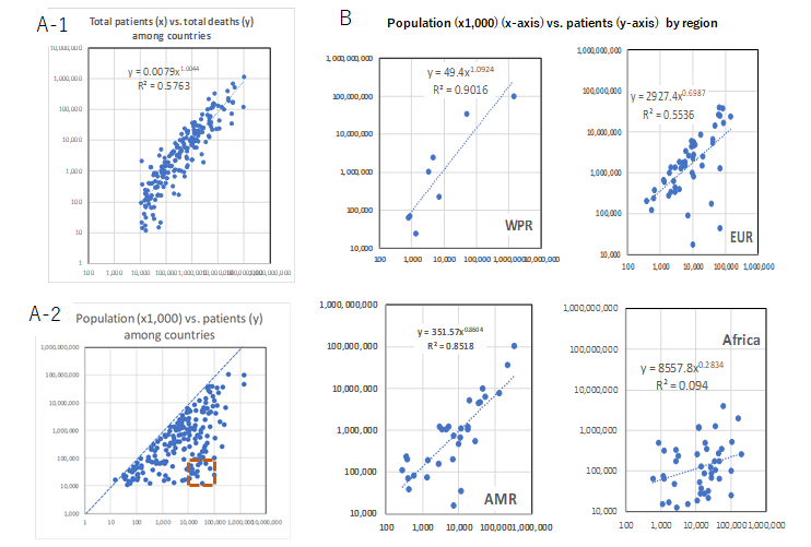
Figure 5: Relation between case and fatality and between the case and population size. A1: the number of the deaths is plotted in vertical axis (y) against number of the patients in horizontal axis (x). A-2: the number of the patients is plotted in vertical axis (y) against population size in horizontal axis (x) for all the countries examined region by region (see text for explanation of countries surrounded in red dotted line).
Discussion and Conclusion
Epidemic curves were synchronized among nearby countries (Figures 1-4) probably not because of horizontal transmission among countries but because of progress of SARS-CoV-2 epidemic as quasi-species [5, 6, 7]. When the number of the patients was plotted in the vertical axis (y) against the population size (x1,000) in the horizontal axis (x) (Figure 5A-2), a cluster of the plots emerged in lower right enclosed with a red line. They are countries with large population with small number of the patients mostly in Africa (see panel Africa in Figure 5B). Underreporting from these countries is probably responsible for this phenomenon.
References
-
Page J, Hinshaw D, McKay B (2021) Hunt for Covid-19 Origin, Patient Zero Points to Second Wuhan Market - The man with the first confirmed infection of the new coronavirus told the WHO team that his parents had shopped there. The Wall Street Journal.
-
Halali M, Halali M, Feraji N, Ranjibar R (2021) Epidemiology of COVID-19: An updated review. J Res Med Sci 26: 82.
-
Zhang T, Nishiura H (2023) Estimating infection fatality risk and ascertainment bias of COVID-19 in Osaka, Japan from February 2020 to January 2022. Sci Rep 13: 5540.
-
Li J, Huang DQ, Zou B, Yang H, Hui WZ, et al. (2021) Epidemiology of COVID-19: A systematic review and meta-analysis of clinical characteristics, risk factors, and outcomes. J Med Virol 93(3): 1449-1458.
-
Yoshikura H (2022) Synchronization of COVID-19 Epidemic among Different Prefectures and Different Age Groups in Japan. Epidemol Int J 6(S1): 000S1-000S19.
-
Yoshikura H (2022) Synchronization of Epidemic Curves of COVID-19 among Nearby Countries. Epidemol Int J 6(1): 000227.
-
Yoshikura H (2022) Persistence of Different Epidemic Pattern of Covid-19 in Western Pacific and in Europe. Epidemol Int J 6(4): 000250.
- Epidemiological Surveillance and Rumors on Social Media
- Awareness and Treatment of Uncontrolled Hypertension in US Overweight/Obese Youths Aged 16–24 Years, NHANES 2021–2023
- Strengthening EPI Through Parental Engagement: Lessons from Dhaka Slums for IA-2030
- Mothers Knowledge of the Prevalence, Causes, Effects, Prevention and Control of Diarrhoea among Children in Ife East Local Government Area, Ile Ife, Osun State, Nigeria
- Covid-19 Reinfections Case Series from October 2023 to October 2024 in A General Medicine Office in Toledo (Spain)
- Water Contact! One Risk Too Many: Risk Factors Associated with Schistosoma haematobium infection in Osun State, Nigeria